Google Accessibility Design Systems
As the Lead Accessibility UX Designer for all of Google’s design systems, I was responsible for developing strategies and partnerships to standardize and improve the accessibility of components and patterns across mobile and web libraries.
To do so effectively, I deconstructed industry guidelines and requirements for design systems teams across Google, including Material Design, and established internal company-wide requirements. I conducted training sessions and workshops to integrate the needs of people with disabilities into design frameworks. I partnered with design systems to create new components, specs, features, and tools to adhere to WCAG compliance and make designing for accessibility easier for product teams.
Furthermore, I grew a team from myself, as a solo UXer, to a team of 5 to expand our work of driving accessibility at Google.
Material 3 Case Study
Challenge – Applying WCAG 1.4.11: Non Text Contrast to Material 3
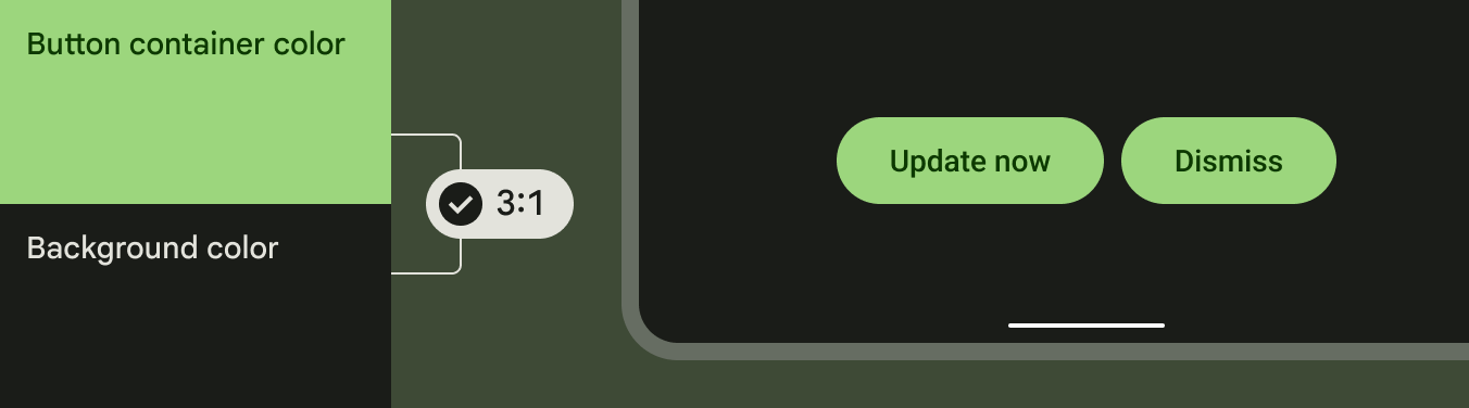
The Web Content Accessibility Guidelines (WCAG) requires that any visual information needed to identify UI components and component states must meet a minimum contrast ratio of 3:1, with an exception of inactive component states and/or when the component is determined by the user agent.
My Role – Lead Accessibility UX Designer
During the development of Material 3 – Google’s new design language, my role encompassed:
Advocating for the needs of people with disabilities through the dissemination of accessibility best practices.
Conducting accessibility audits of GM2 and GM3 components to assess the level of compliance. The audit gained leadership buy-in and organizational prioritization.
Leading a cross-functional sprint with Material’s lead UX designer and Material’s creative director. The sprint resulted in both short term and long term initiatives to improve the contrast of algorithmically generated color palettes. Sprint outcomes were presented to Material’s VP of Design and the VP of Android.
Guiding component updates and enacting internal contrast requirements to ensure inclusive design systems and product launches. Guidance published in Material 3 official site.
Process
Understanding WCAG 1.4.11
Low contrast controls are more difficult to perceive, and may be completely missed by people with a visual impairment. People with disabilities should not require contrast-enhancing assistive technologies to perceive and understand the UI.
Active User Interface Components
Any visual information that is necessary for a user to identify a control, the control’s state, and how to operate it must have a minimum 3:1 contrast ratio with the adjacent colors.

Boundaries
It is recommended for people with cognitive disabilities to delineate the boundary of a control and/or container to aid in the recognition and completion of activities.

Adjacent Colors
The visual attributes of a component that communicate perception and operability must contrast with the adjacent background, as well as, adjacent components if they appear next to each other.

Material Design System Audit

To better communicate WCAG 1.4 and collaborate with Material stakeholders, I conducted an audit of Google Material 2 and Google Material 3 components using contrast checking tools. I developed a product requirements document (PRD) to share the results of the audit and initiate a concerted collaboration between the Google Accessibility team and Material Design team.
The PRD drove alignment on which of Material’s components needed accessibility improvements, drove the prioritization for a component updates roadmap, and overall, captivated the attention and dedication of Material leadership, resulting in cross-organizational buy-in.
Non Text Contrast in Material 3 became a top priority for the new Material design system and Android releases.

Stakeholder Alignment via Cross-Functional Sprint
Material 3 uses algorithmically generated color palettes based on preset themes or users’ backgrounds. Simply updating the algorithmic color palettes was infeasible due to time and engineering constraints, as well as, implied greater repercussions on internal design systems relying on Material Design.
Additionally, a greater question of, “What constitutes as contrast?” arose.

2-Week Design Sprint
To tackle these constraints, I led 10 designers through a 2-week design sprint as the Accessibility UX Design Lead with the Material Design Lead and the Material Creative Director.
On the first day, I aligned the team and built empathy by delivering a lightning talk about the needs of people with disabilities, their assistive technology usage using disability simulations, the current state of Material’s design system, and highlighted critical design principles, such as the semantic meaning of color based on cultural perception.
Contrast Beyond Color
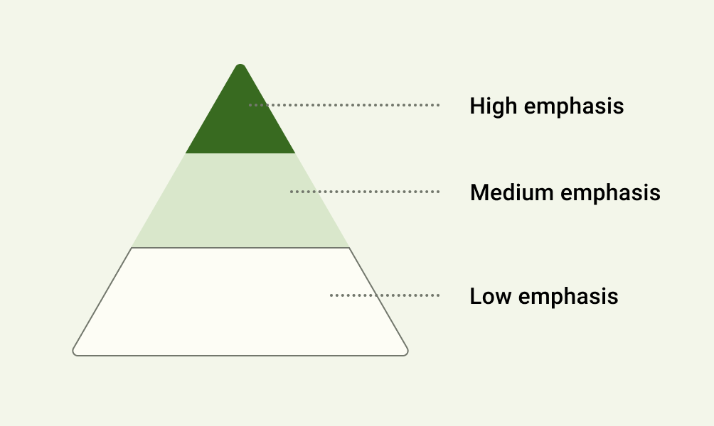
Throughout the 2 weeks, we as a team questioned if all elements really needed to meet 3:1 contrast. We visualized how every element meeting 3:1 contrast oftentimes resulted in a visually loud experience – rendering all actions useless for someone with a cognitive disability or someone who has sensitivities to light.
Therefore, we discussed how hierarchy is built into the design language through layout, form, size, and explored ways to further this within the design system. Creating more contrast between color tones was one of the solutions that I advocated for to support accessibility.
Solution
I, alongside other designers, presented the sprint’s outcome to the Material Design Director, the VP of Material Design, and the VP of Android. The team landed on short-term objectives to improve commonly used components originally outlined in my audit, as well as, long-term goals which explored more personalized experiences for users at an individual level.
Meeting a contrast requirement of 3:1 for every component on the screen can be distracting at best, so opting for combining colors based on their tonality, rather than hex value or hue, is key to ensuring any color output accessible in Material 3.

Accessibility UX Guidance
Through the Google Accessibility and Material Design collaboration, we defined guidelines based on user research and sprint outcomes. These guidelines were published under accessibility on the Material 3 official site.
Clustered Components
Elements that are clustered with others, such as a group of buttons, benefit from 3:1 contrast between themselves and the background because they require the user to distinguish each button from the set, and from the UI background.


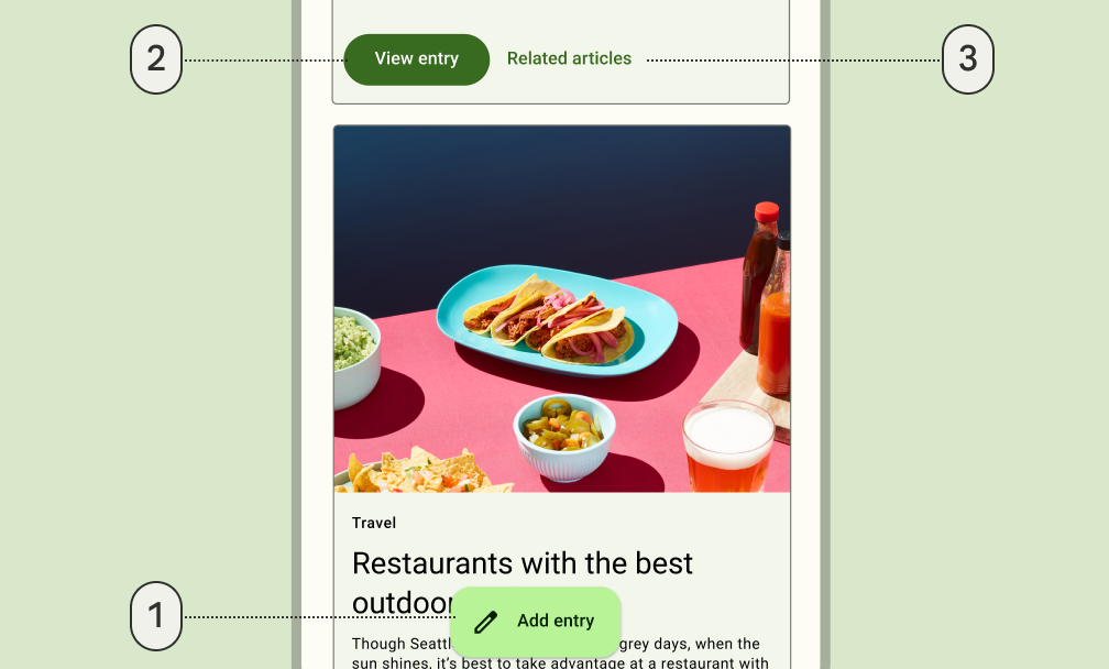
Prominent Components
Elements that stand on their own and apart from other elements on the screen, such as a floating action button (FAB), don’t benefit from 3:1 contrast because they are already distinguishable to users due to their prominence.

Conclusion
Through cross-functional collaboration, Material 3 optimizes accessibility with tonal palettes and elemental hierarchy. Components that benefit from 3:1 contrast have been updated for Android 12 release.
